首先让我告诉你关于 Flutter 中按钮的一件重要事情,在flutter最新版本中以下Buttons在fluter中被废弃了:
| 废弃的 | 推荐的替代 |
|---|---|
| RaisedButton | ElevatedButton |
| OutlineButton | OutlinedButton |
| FlatButton | TextButton |
那么让我们来探索一下 Flutter 中的按钮。
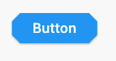
Elevated Button
StadiumBorder
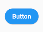
ElevatedButton(
  onPressed: (){},
  child: Text('Button'),
  style: ElevatedButton.styleFrom(
  shadowColor: Colors.green,
  shape: StadiumBorder(),
  padding: EdgeInsets.symmetric(horizontal: 35,vertical: 20)),
)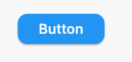
ElevatedButton(
  onPressed: (){},
  child: Text('Button'),
  style: ElevatedButton.styleFrom(
  shadowColor: Colors.green,
  shape: RoundedRectangleBorder(
  borderRadius: BorderRadius.circular(12),
      ),
   ),
),
CircleBorder
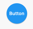
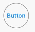
ElevatedButton(
  onPressed: () {},
  child: Text('Button'),
  style: ElevatedButton.styleFrom(
    shape: CircleBorder(),
    padding: EdgeInsets.all(24),
  ),
)
BeveledRectangleBorder
ElevatedButton(
  onPressed: () {},
  child: Text('Button'),
  style: ElevatedButton.styleFrom(
    shape: BeveledRectangleBorder(
      borderRadius: BorderRadius.circular(12)
    ),
  ),
)
Outlined Button
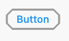
StadiumBorder

OutlinedButton(
  onPressed: () {},
  child: Text('Button'),
  style: OutlinedButton.styleFrom(
    shape: StadiumBorder(),
  ),
)
RoundedRectangleBorder

OutlinedButton(
  onPressed: () {},
  child: Text('Button'),
  style: OutlinedButton.styleFrom(
    shape: BeveledRectangleBorder(
      borderRadius: BorderRadius.circular(12),
    ),
  ),
)
CircleBorder
OutlinedButton(
  onPressed: () {},
  child: Text('Button'),
  style: OutlinedButton.styleFrom(
    shape: CircleBorder(),
    padding: EdgeInsets.all(24),
  ),
)
BeveledRectangleBorder
OutlinedButton(
  onPressed: () {},
  child: Text('Button'),
  style: OutlinedButton.styleFrom(
    shape: BeveledRectangleBorder(
      borderRadius: BorderRadius.circular(12),
    ),
  ),
)